Ultimate Waterfall (API) End User Documentation
Version: 1.1.1.10
Publisher: dataviz.boutique
Support: https://dataviz.boutique
Ultimate Waterfall (API) is a Power BI custom visual for building waterfall charts with contribution bars, totals, starting and ending values, reference values, small multiples, line overlays, subtotals, table values, labels, highlights, hierarchy coloring, and outlier handling.
Use the visual when you need to explain how positive and negative changes move a value from a start point to an end point, compare measures against references, or show step-by-step business drivers across categories.
Original Release Highlights, Examples, and Registration
Power BI Ultimate Waterfall Custom Visual (Release!) – Power BI visualizations
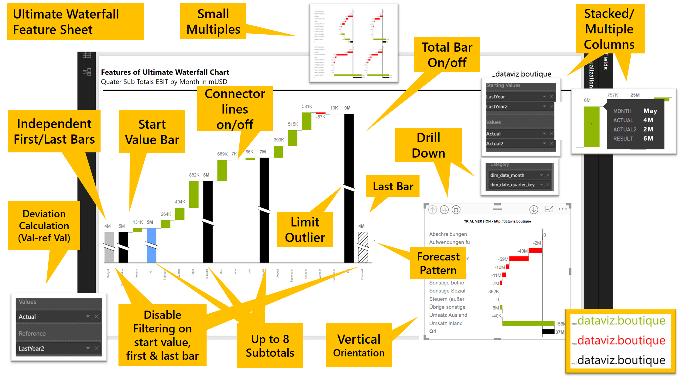
- Waterfall charts also have other names, such as walk charts, bridge charts, flying brick charts, and Mario charts (as in Nintendo).
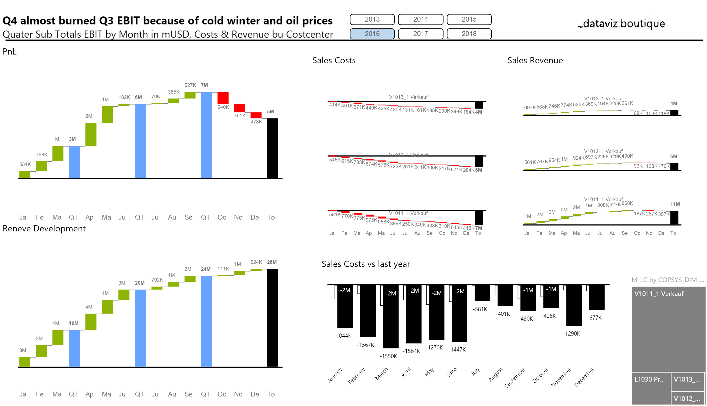
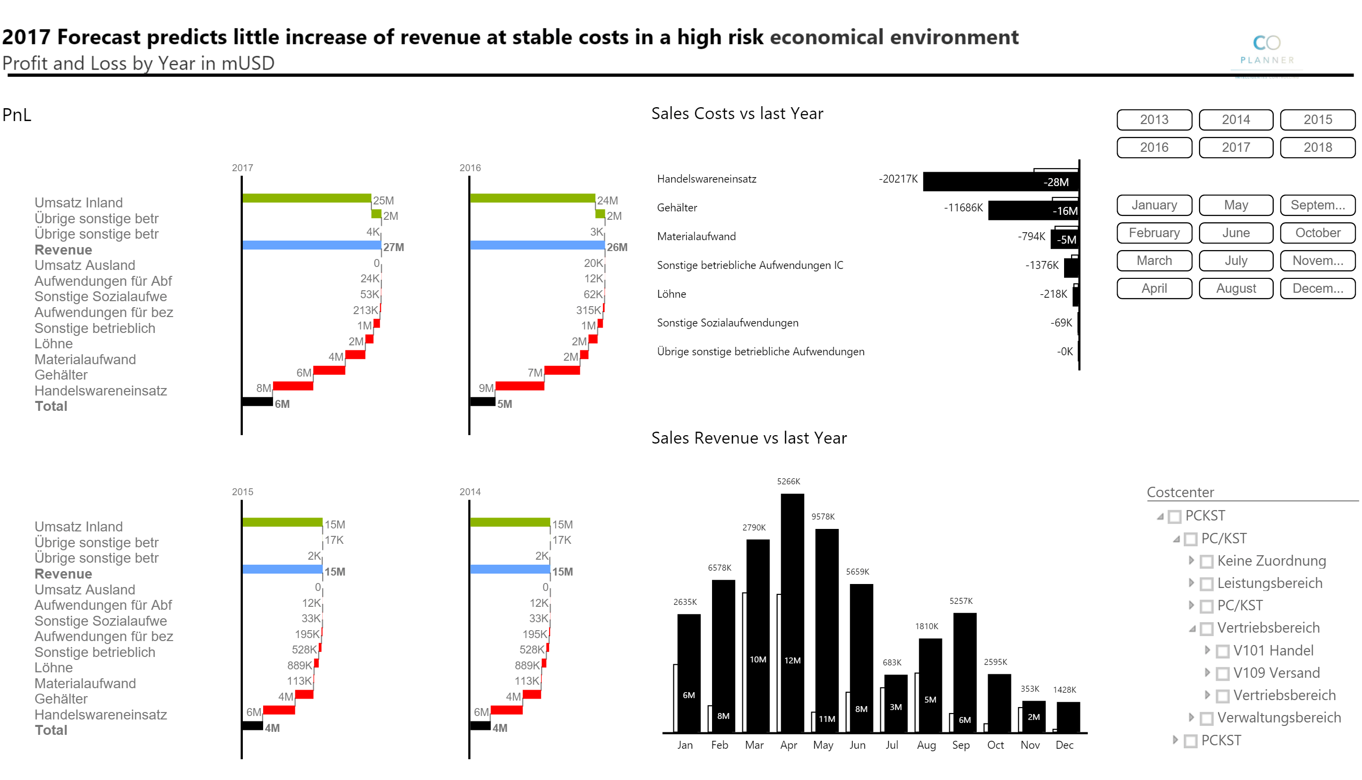
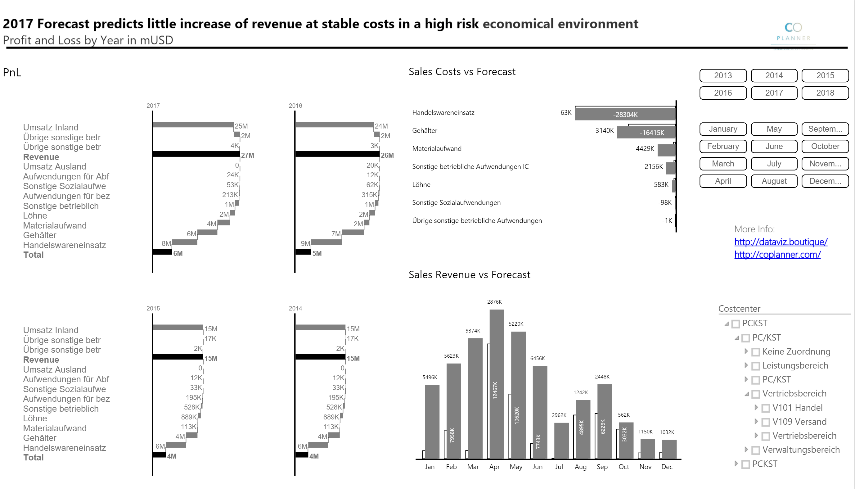
- Calculation waterfalls (vertical axis) – the status bars represent base and result measures (for example, sales and EBIT), while the contribution bars in between represent the increase or decrease of the measures.
- Chart orientation – choose horizontal orientation for time series and vertical orientation for categories.
- IBCS (R) color theme as the default colors
- Small multiples – available in both orientations; change the number of columns or rows.
- Scaling within small multiples
- Define up to eight subtotals
- Support for variance waterfalls
- Define start value
- Define or calculate deviation as increase/decrease
- Total value = start value +/- increase/decrease
- Limit outliers
- Stacked value fields
- Independent first bar and last bar
- Drill down and up
- Hatched bar background
 |
 |
 |
 |
Video: Power BI Ultimate Waterfall Chart
Video: Power BI Ultimate Waterfall Chart subtotals
Register for your Ultimate Waterfall Chart today
Please do not hesitate to contact us using the form or read the FAQ:
Related: Ultimate Waterfall licenses and product options.
Documentation
Add the Visual to a Report
- Open Power BI Desktop.
- Choose Import a visual from a file.
- Select the
.pbivizpackage for Ultimate Waterfall (API). - Add the visual to the report canvas.
- Add fields to the visual wells described below.
Data Fields
The visual exposes these field wells:
| Field well | Required | Use |
|---|---|---|
| Category | Usually required | Defines the waterfall steps or labels. Drilldown is supported on this role. |
| Small Multiples | Optional | Splits the visual into multiple small charts by group. |
| Measure Data | Commonly required | Main numeric measure used for contribution bars. |
| Starting Values | Optional | Supplies explicit starting values instead of deriving the start from the measure flow. |
| First Values | Optional | Supplies or styles first bar values for specific scenarios. |
| Second Last Values | Optional | Supplies or styles the second-last bar. |
| Last Values | Optional | Supplies or styles final values. |
| Reference | Optional | Adds a reference series/value. |
| Reference2 | Optional | Adds a second reference series/value. |
| Table Value(s) | Optional | Adds values to the table displayed with the chart. |
| Tooltips | Optional | Adds extra fields to tooltip content. |
| Sign | Optional | Controls sign behavior when supplied as a measure. |
Common setup patterns:
- Basic waterfall: add
CategoryandMeasure Data. - Waterfall with a known start and end: add
Category,Measure Data, and the relevantStarting Values,First Values,Last Values, orSecond Last Valuesfields. - Small multiples: add
Category,Measure Data, andSmall Multiples. - Reference comparison: add
Category,Measure Data, andReferenceorReference2. - Table-enhanced waterfall: add
Category,Measure Data, and one or moreTable Value(s)fields.
Formatting Pane
Open the visual formatting pane in Power BI to configure the sections below.
About
The About card contains support and license information.
| Setting | Use |
|---|---|
| Support | Shows the support website. |
| Version | Shows the visual version. |
| License Key | Enter a license key if required. |
| Info | Shows decoded license or status information. |
| Plan Expired | Shows whether the plan is expired. |
| Plan Name | Shows the active plan name. |
Chart Render
Use Chart Render for overall layout and axis behavior.
| Setting | Use |
|---|---|
| Padding | Controls space around the chart. |
| Flip Orientation | Switches between the default orientation and the flipped orientation. |
| Merge Last and Total Bars | Combines the final bar and total bar presentation. |
| Show Y Axis | Displays or hides the Y-axis. |
| Show Origin Line | Displays the zero/origin reference line. |
Show brackets () for negative values |
Formats negative values with brackets. |
Bars
Use Bars for bar labels, number formatting, total bar styling, and custom bar colors.
| Setting | Use |
|---|---|
| Show Labels | Shows or hides bar value labels. |
| Rotate Labels | Rotates bar labels when orientation supports it. |
| Label Background | Adds a background behind labels. |
| Background Color | Sets the label background color. |
| Background Transparency | Controls label background transparency from 0 to 100. |
Show + Sign for Positive Values |
Adds a plus sign to positive values. |
| Numerical Precision | Sets decimal precision from 0 to 10. |
| Data Unit | Chooses Auto, None, Percent, Thousand, Million, Billion, or Trillion. |
| Show Data Unit | Shows or hides the selected unit suffix. |
| Text Size | Sets bar label text size. |
| Text Color | Sets bar label text color. |
| Font Family | Sets bar label font. |
| Total Bar | Shows or hides the total bar. |
| Total Bar Color | Sets the total bar color. |
| Custom Bar Color | Sets a custom bar color. |
| Custom Bar Color Indices | Applies the custom color to selected bar positions, such as 1,2,3. |
| Show Custom Color for All Bars | Applies the custom color to all bars. |
Some options appear only when the related feature is enabled. For example, background color and transparency appear when Label Background is on, and custom color index options appear after a custom bar color is selected.
Y-axis
Use Y-axis to control the numeric range.
| Setting | Use |
|---|---|
| Min | Sets a custom axis minimum. |
| Max | Sets a custom axis maximum. |
| Reset axis range | Returns the axis range to automatic behavior. |
Subtotal
Use Subtotal to insert subtotal bars and define their names and colors.
| Setting | Use |
|---|---|
| Subtotal | Enables subtotal bars. |
| Subtotal Type | Choose Automatic or Manual. |
| Subtotal Bar Indices | For manual subtotals, enter bar positions such as 1,2,3. |
| Name 1 to Name 8 | Sets labels for up to eight subtotal definitions. |
| Color 1 to Color 8 | Sets colors for up to eight subtotal definitions. |
When Automatic subtotal type is selected, the manual subtotal index field is hidden.
Reference
Use Reference when the Reference or Reference2 field wells are populated.
| Setting | Use |
|---|---|
| Negative for Reference Label | Inverts the sign interpretation for reference labels. |
| Show reference bars | Shows or hides reference bars. |
| New Connection Line | Uses the alternate connection-line style. |
Labels
Use Labels to style category labels.
| Setting | Use |
|---|---|
| Text Color | Sets label text color. |
| Text Size | Sets label text size. |
| Font Family | Sets label font. |
| Bolden Labels | Enables bold formatting for selected labels. |
| Bolden Labels at Indices | Enter label positions such as 1,2,3. |
| Bolden All Labels | Makes all labels bold. |
| Overlap Mitigation | Enables controls to reduce label collisions. |
| Truncate Labels | Limits label length. |
| Multiline Labels | Allows labels to wrap across multiple lines. |
| Degree of Rotation | Sets the label rotation angle from 0 to 360. |
| Horizontal Position | Moves labels horizontally. |
| Vertical Position | Moves labels vertically. |
The index and bold-all options appear when Bolden Labels is enabled. Truncation, rotation, and position controls appear when Overlap Mitigation is enabled.
Legend
Use Legend to show and style the visual legend.
| Setting | Use |
|---|---|
| Show | Shows or hides the legend. |
| Marker Size | Sets legend marker size. |
| Font Family | Sets legend font. |
| Text Color | Sets legend text color. |
| Text Size | Sets legend text size. |
Line Chart
Use Line Chart to overlay a line series on the waterfall.
| Setting | Use |
|---|---|
| Show | Shows or hides the line chart overlay. |
| Line Color | Sets line color. |
| Line Thickness | Sets line thickness from 0 to 10. |
| Overlap Color Setting | Chooses how the line blends with other elements. Options include Normal, Multiply, Screen, Overlay, Darken, Lighten, Difference, Hue, Saturation, Luminosity, and others. |
| Line Ending Style | Chooses Round or Square line ends. |
| Line Style | Chooses Normal, Dotted, or Dashed. |
| Show Markers | Shows or hides point markers. |
| Marker Size | Sets marker radius. |
| Marker Outline Thickness | Sets marker outline thickness. |
| Marker Outline Color | Sets marker outline color. |
| Marker Fill Color | Sets marker fill color. |
| Show Area Under the Line | Fills the area under the line. |
| Area Color | Sets the area fill color. |
| Area Opacity | Sets the area opacity from 0.0 to 1.0. |
Marker settings appear when Show Markers is on. Area color and opacity appear when Show Area Under the Line is on.
Highlight 1, Highlight 2, and Highlight 3
Use Highlight 1 through Highlight 3 to mark ranges between selected start and end bar positions.
| Setting | Use |
|---|---|
| Show | Enables the highlight. |
| Badge Type | Chooses Rectangle or Bubble. |
| Text Size | Sets badge text size. |
| Font Family | Sets badge font. |
| Line Color | Sets highlight line color. |
| Badge Color | Sets badge color. |
| Use Sentiment Color | Uses the configured sentiment colors instead of manual colors. |
| Negative for highlight | Inverts sign interpretation for the highlight. |
| Starting Indices | Enter start bar positions such as 1,2,3. |
| Ending Indices | Enter end bar positions such as 2,3,4. |
| Arrow Size | Sets arrow size. |
| Show Starting Arrow | Shows an arrow at the start of the highlight. |
| Show Ending Arrow | Shows an arrow at the end of the highlight. |
Highlight for Total and Last Bar
This highlight is intended for the relationship between the total bar and the last bar.
Available settings include Show, Badge Type, Text Size, Font Family, Line Color, Badge Color, Use Sentiment Color, Negative for highlight, Arrow Size, Show Starting Arrow, and Show Ending Arrow.
Highlight for Last and Second Last Bar
This highlight is intended for the relationship between the last bar and the second-last bar.
Available settings include Show, Badge Type, Text Size, Font Family, Line Color, Badge Color, Use Sentiment Color, Negative for highlight, Arrow Size, Show Starting Arrow, and Show Ending Arrow.
Sentiment Color
Use Sentiment Color to control colors for increases, decreases, and conditional formatting.
| Setting | Use |
|---|---|
| Use Conditional Formatting | Uses Power BI conditional formatting rules for sentiment color. |
| Increase | Sets the increase color. Default: #6FD44D. |
| Decrease | Sets the decrease color. Default: #ff2800. |
| Conditional Color | Defines rule-based conditional color when conditional formatting is enabled. |
| Negative is Good | Treats negative changes as favorable and swaps sentiment interpretation. |
When Use Conditional Formatting is off, Increase, Decrease, and Negative is Good are available. When it is on, Conditional Color is used instead.
Table
Use Table to display supporting values below or alongside the chart, depending on the visual layout.
| Setting | Use |
|---|---|
| Show | Shows or hides the table. |
| Text Size | Sets table text size. |
| Font Family | Sets table font. |
| Column Spacing | Adjusts spacing between table columns. |
| Format Values | Applies numeric formatting to table values. |
| Formatting Precision | Sets table decimal precision. |
| Table Header | Shows or hides the table header. |
| Header Grid Symbols | Shows or hides header symbols. |
| Measure Values | Shows measure values in the table. |
| Reference Values | Shows reference values in the table. |
| Absolute Variance | Shows absolute variance. |
| Variance % | Shows percentage variance. |
| Result | Shows result values. |
| Header Symbol Type | Chooses Line, Rectangle, Hatched Rectangle, or Parallel Lines for each table item type. |
| Symbol Color | Sets the symbol color for each table item type. |
Formatting Precision appears when Format Values is on. Header symbol style and color settings appear when Header Grid Symbols is on.
Limit Outlier
Use Limit Outlier to cap very large values and mark them with an axis-break identifier.
| Setting | Use |
|---|---|
| Limit Outlier | Enables outlier limiting. |
| Outlier Value | Sets the maximum displayed outlier threshold. |
| Limit Total | Applies the limit to total values. |
| Limit First Values | Applies the limit to first values. |
| Limit Second Last Values | Applies the limit to second-last values. |
| Limit Last Values | Applies the limit to last values. |
| Show Outlier Identifier (Axis Break) | Shows an axis-break marker on limited values. |
| Identifier Size | Sets marker size. |
| Identifier Color | Sets marker color. |
| Identifier Type | Chooses Polygon or Gradient. |
| Identifier Position | Moves the marker position. |
Identifier styling options appear when Show Outlier Identifier is on.
Starting Value, First Value, Last Value, and Second Last Value
These cards style special value bars.
| Card | Default color | Settings |
|---|---|---|
| Starting Value | #B2BEB5 |
Name, Color, Border Color, Style |
| First Value | #FF7F50 |
Name, Color, Border Color, Style |
| Last Value | #17A589 |
Name, Color, Border Color, Style |
| Second Last Value | #F0B27A |
Name, Color, Border Color, Style |
The Style setting supports Solid and Pattern.
Hierarchy
Use Hierarchy to assign colors to category hierarchy levels.
| Setting | Default color |
|---|---|
| Level 1 | #003396 |
| Level 2 | #154197 |
| Level 3 | #2e5090 |
| Level 4 | #3A5891 |
| Level 5 | #496291 |
| Level 6 | #5F7295 |
| Level 7 | #728099 |
| Level 8 | #818A9B |
Tips for Report Authors
- Start with Category and Measure Data, then add optional fields one at a time.
- Use Reference fields when you need a target, budget, prior period, or benchmark comparison.
- Use Table Value(s) for values that should be visible without requiring tooltip interaction.
- Use Tooltips for additional context that should appear only on hover.
- Use Small Multiples when the same waterfall logic should be repeated by business unit, region, scenario, or product group.
- Use Subtotal when the report needs intermediate totals within the waterfall sequence.
- Use Limit Outlier when one very large value compresses the rest of the chart.
- Use Sentiment Color consistently across reports so increases and decreases have the same meaning for readers.
Troubleshooting
| Symptom | What to check |
|---|---|
| The visual is blank | Confirm that Category and a valid numeric measure are assigned. |
| Values look too small or too large | Check Data Unit, Numerical Precision, and axis Min/Max settings. |
| Labels overlap | Enable Overlap Mitigation, rotate labels, truncate labels, or reduce text size. |
| Custom bar colors do not apply | Confirm a Custom Bar Color is selected and that the indices match the intended bar positions. |
| Subtotal positions do not apply | Confirm Subtotal is enabled and Subtotal Type is Manual. |
| Line markers are missing | Enable Line Chart and Show Markers. |
| Area fill is missing | Enable Line Chart and Show Area Under the Line. |
| Table symbols are missing | Enable Table, Table Header, and Header Grid Symbols. |
| About version appears wrong | Confirm the installed .pbiviz package is version 1.1.1.10. |
Current Package
The current packaged visual in this folder is:
Waterfall2023Pbi552BC2DB21894DA5B40D0FE0FE33D590.1.1.1.10.pbiviz