The Financial Visuals Reference – Management Reporting in Power BI
The Financial Visuals Reference – Management Reporting in Power BI
Dataviz creates Power BI visuals for waterfall, variance, KPI, decomposition tree, stacked, and Sankey reporting.
The Financial Visuals Reference – Management Reporting in Power BI
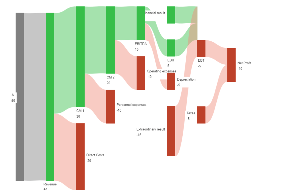
Transforming financial statements into visually appealing Sankey diagrams has never been easier. Our advanced tool lets you quickly convert complex financial data into Sankey diagrams with just a few clicks. It can also visualize negative…
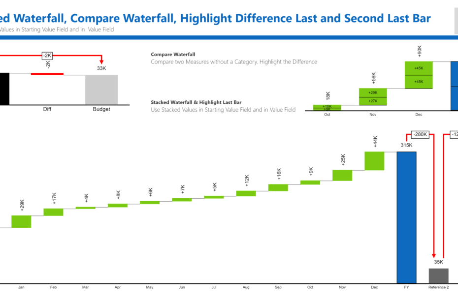
New Features for the Ultimate Waterfall Chart 4.0 Compare two measures without a category, and highlight the difference. Use stacked values in the Starting Value field and the Value field (positive values only). Stacked Waterfall…
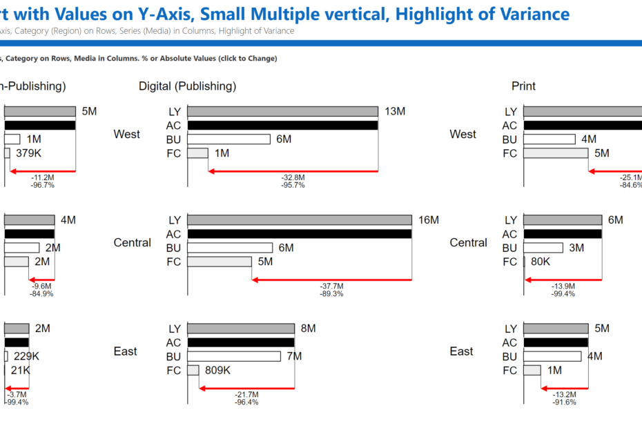
Power BI stacked chart reporting use cases Ultimate Stacked is useful when a Power BI report has to show both the total value and the mix behind that total. Typical examples include revenue by product…
Here is the chatbot FAQ.
This guide explains how report consumers and report authors can use and configure the Ultimate KPI Card 5.1.2.3 API License Power BI custom visual. It is written from an end-user/report-author perspective and focuses on the…
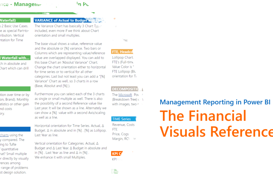
The Financial Visuals Reference: Management Reporting in Power BI The Waterfall Contributions Analysis charts have two basic use cases: showing the contribution of a category or time period as a special part-to-whole chart, and showing…
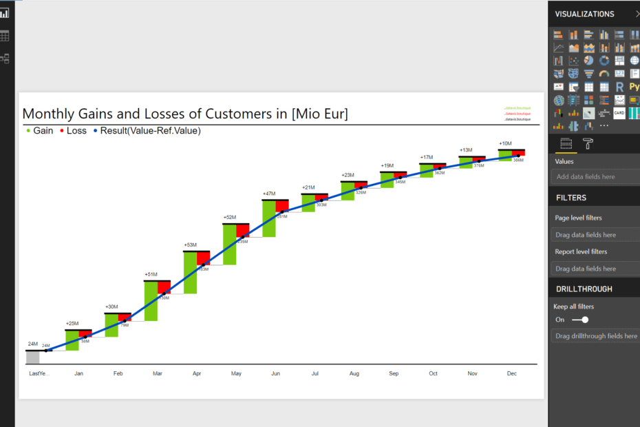
Powered by the Power BI Ultimate Waterfall Chart from https://dataviz.boutique Do you have any of these or similar scenarios where you need to visualize gains and losses? Subscriber or member fluctuation over time or by…
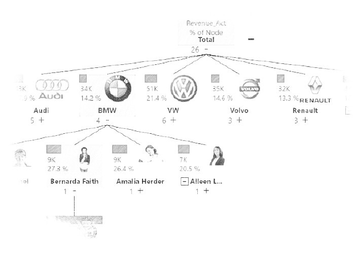
Breakdown Tree The Microsoft Power BI Ultimate Decomposition Tree (Breakdown Tree) can display hierarchical information with images, two measures, and percentage calculations. This kind of visualization is well known from the great ProClarity software that…