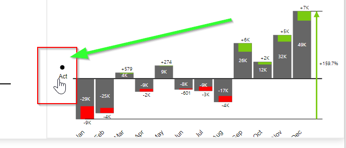
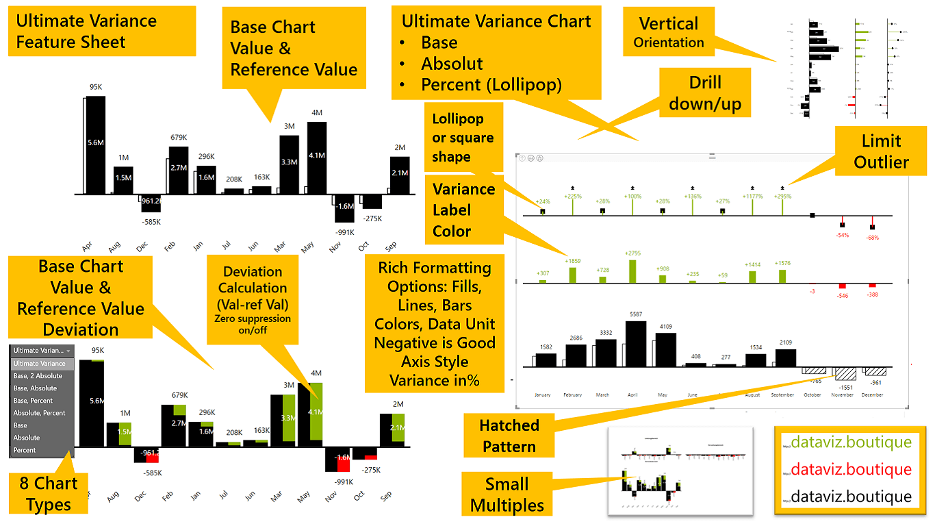
This chart is designed to compare and visualize variances in finance, such as actuals vs. budget or forecast. The Power BI Ultimate Variance Chart custom visual includes three basic chart types. The base visual shows a value, a reference value, and the deviation between them. Two bars or columns representing the value and reference value can be displayed as overlapping bars, or an in-bar chart style can be selected. You can add an “Absolute Variance” and/or a “Percent/Lollipop Chart” to this base chart. The in-bar chart style is also available. In vertical orientation, there is also a drill-down table. Last but not least, small multiples are supported.
Download the full documentation and trial versions by providing your details:
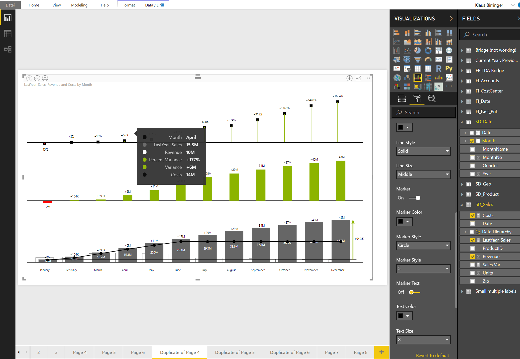
This example uses a time series, so we choose a vertical X-axis for that purpose. First, select a category, such as month for a time series. Then select the actual value, for example January through September, the forecast value through year end, and finally the budget value. You can now see three charts: the base chart, with actuals as black columns and the budget as white columns; the last three columns show the forecast as hatched columns instead of missing actuals for this period. The second chart, above the base chart, shows the absolute variance from actual to budget value. The third chart, at the top of the visual, contains the variance in percent, shown as a lollipop chart. If you click the axis title, the chart will be sorted by variance: ascending, descending, or no sort. If you want to sort by category, use the standard Power BI sort option. You can find this sorting option by clicking the three dots in the top-right corner of the visual. In the visual settings, you will find the Chart Render menu. Here you can change how many charts are visible. You can then click the large arrows to change to a different chart type. The base chart can be changed to the in-bar style, or you can display only a single lollipop or absolute variance chart.
Profit and loss, Power BI table, IBCS, finance, forecast, variance. How to make an income statement in Power BI. Create a new chart and change the orientation setting to vertical. Fill the fields for actual, budget, and last-year values. Fill the category with a profit and loss hierarchy. Disable the last-year value line. Change the base chart type to display only actual and budget, with no variance. Sort the chart by variance by clicking the small arrow and circle icons, or sort the category by using standard Power BI functionality. Change the space usage of the chart to fixed, which is useful once you expand the hierarchy. Enable drill-down by category levels by clicking the hierarchy symbol once for each level. You can control how many levels are enabled for drill-down with the navigation toggles. You can either expand a full level with the large plus and minus symbols in the top-right corner, or drill down into a single node by clicking the small plus and minus symbols. Enable table values to display the chart values in a table as well: actual, budget, last year, and their variances. You can change the header shape if needed. Choose from line, rectangle, or hatched, and format it according to your needs. Add additional columns to the table that are not part of the chart. You can format them in the table header value settings. Enable or disable columns in the table using the Table Settings menu. You can control all values used in the chart here. In the Table Header Settings, you can change the labels of the variance columns calculated by the visual. In the Table Header Value Settings, you can change the header shape for additional columns. Change chart types by clicking the large arrows. Disable navigation toggles once you have finished the design. Mark columns as bold with a right-click. Certified and available in Microsoft AppSource and on request at: Email: license@dataviz.boutique https://dataviz.boutiquehttps://datadriven.pro/
Ask me a question. We moved the Power BI Ultimate Variance Chart – FAQ (IBCS (R)) and documentation to the bot:
Sorting
Sorting
Click the axis title to sort by variance. Set it to “circle” to use Power BI Desktop’s built-in sorting:
Always use two fields:
Use Value – (minus) Reference Value (Actual – Budget, …)
or
Value + (plus) Deviation Value (Actual + Movement)
The visual can also show the “Last Year” value as a line for comparison.