Power BI Ultimate Variance Chart Custom Visual – IBCS (R) – Power BI visualizations
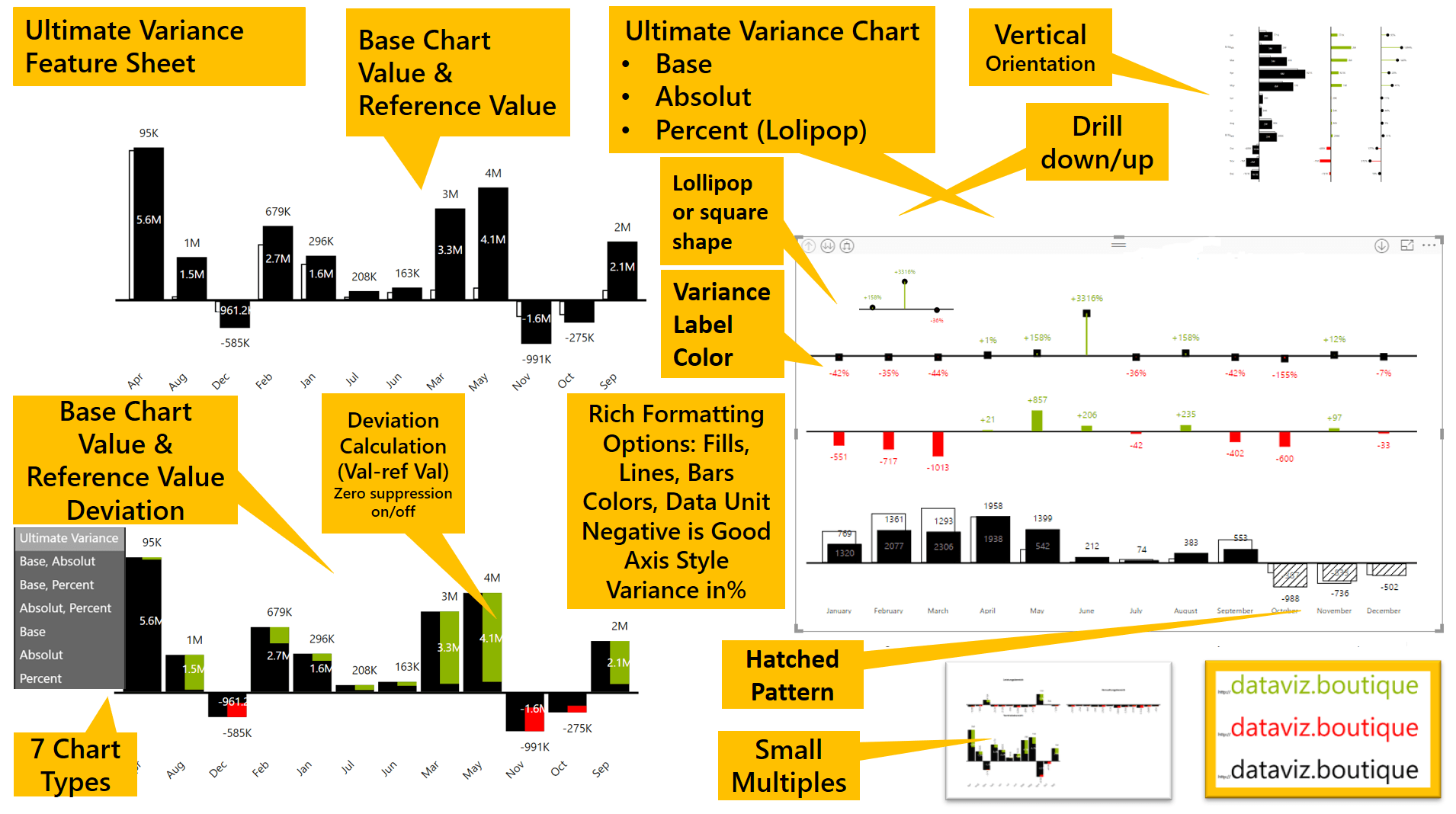
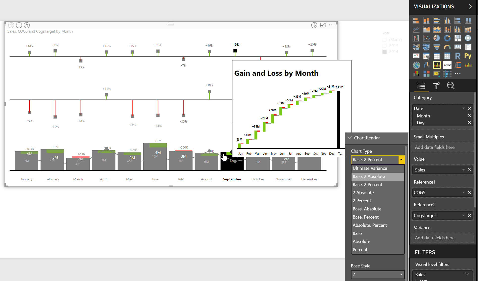
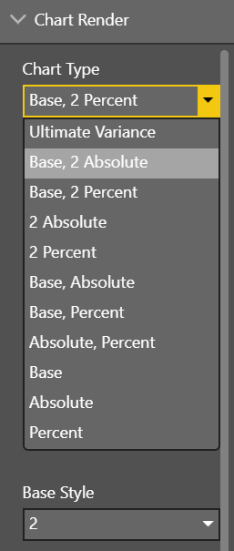
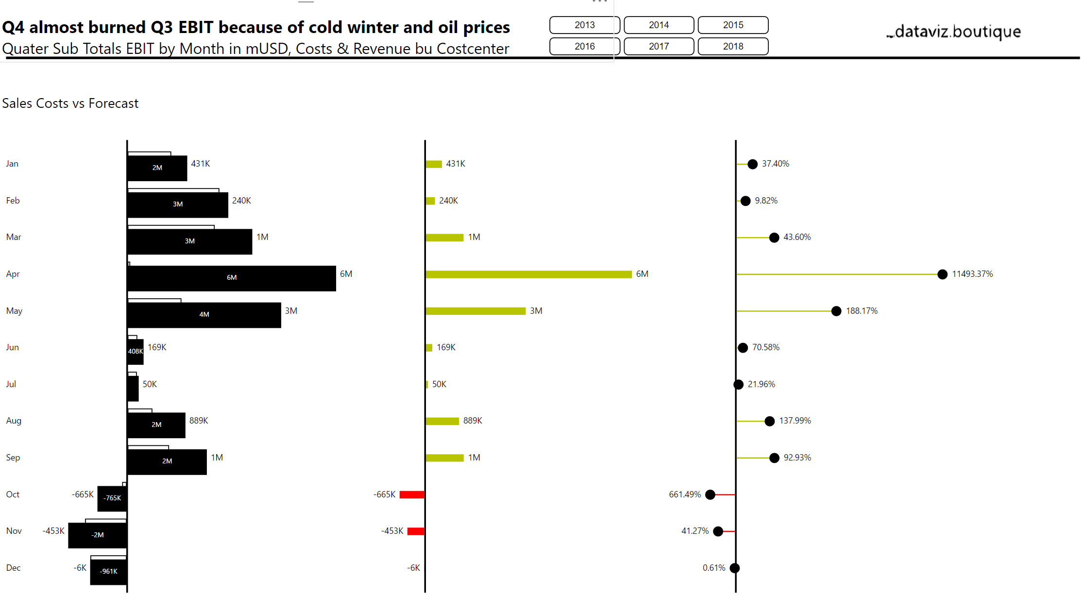
The Power BI Ultimate Variance Chart custom visual includes three basic chart types. The base visual shows a value, a reference value, and the deviation. Two bars or columns representing the value and reference value are displayed as overlapping bars. You can add an “Absolute Variance” chart to this base chart. Change the chart orientation to horizontal for time series or to vertical for all other categories. Last but not least, you can also add a “Percent Variance” chart, so three charts are shown in a row: base, absolute, and percent. Furthermore, you can select each of the three charts as a single chart or as small multiples. Useful chart settings that you already know from other dataviz.boutique charts are also available. The charts broadly follow IBCS (R), a business data visualization standard.
Video:
The following chart types, or combinations of them, are available:
Register for private preview here: (* indicates required)