This guide explains how report consumers and report authors can use and configure the Ultimate KPI Card 5.1.2.3 API License Power BI custom visual. It is written from an end-user/report-author perspective and focuses on the settings available in the visual formatting pane.
Microsoft AppSource / Marketplace: https://marketplace.microsoft.com/en-us/product/datavizboutiquegmbh1631474046585.ultimate_kpi_cards
What the visual does
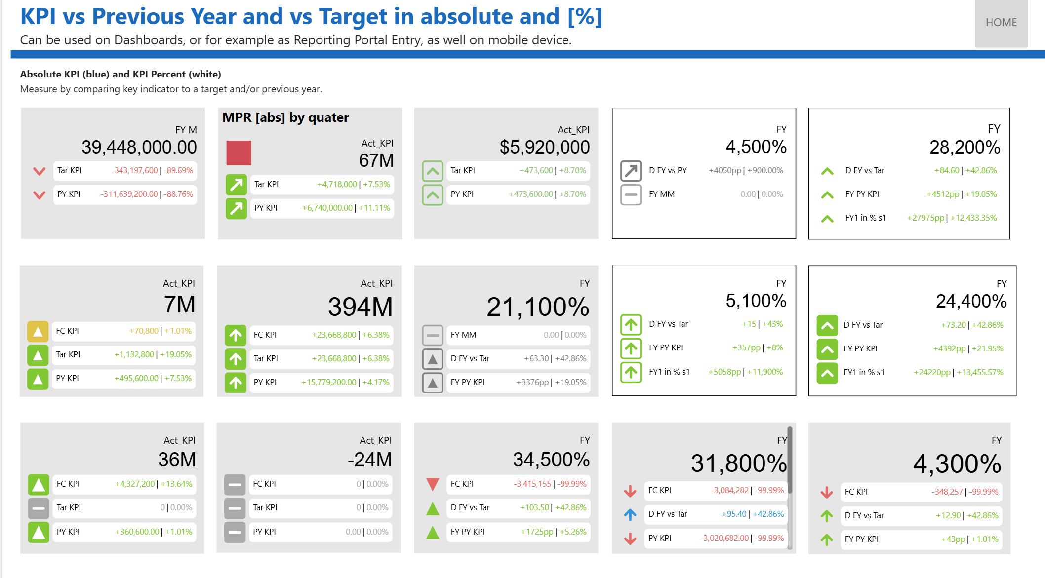
The Ultimate KPI Card visual displays a key measure together with up to three reference measures. For each reference, the visual can show the reference value, the absolute variance, and the percentage variance. It can also display directional arrow indicators, small-multiple KPI cards, a trend chart, and optional images/status shapes.
It can be used on dashboards, as a reporting portal entry, and on mobile devices. It shows a measure by comparing a key indicator with a target and/or the previous year.
The visual shows a value, its variance to a reference value, and its variance to a second reference value in absolute terms and as a percentage, with arrow and color indicators. Small multiples support multi-variant reporting by category.
Typical use cases include:
- Actual vs Budget performance cards.
- Actual vs Plan or Forecast cards.
- Current value vs Previous Year cards.
- KPI tiles by product, region, department, or customer segment.
- KPI cards with trend history over time.
Required and optional fields
Add fields to the visual from the Build visual pane.
| Field well | Required | Field type | Purpose |
|---|---|---|---|
| Small Multiple | No | Category/grouping | Creates one KPI card per category, such as region or product. |
| Trends | No | Category/grouping | Provides the category axis for the trend chart, commonly a date, month, or period field. |
| Value | Yes | Numeric measure | Main KPI value, such as Sales, Revenue, Margin, or Units. |
| Reference 1 | No | Numeric measure | First comparison value, commonly Budget or Target. |
| Reference 2 | No | Numeric measure | Second comparison value, commonly Plan or Forecast. |
| Reference 3 | No | Numeric measure | Third comparison value, commonly Previous Year or Baseline. |
| Status | No | Measure | Numeric status code used by manual status shapes. Use 1 for circle, 2 for triangle, and 3 for square. |
| Images | No | Category/grouping | Image URL or image value used when small multiples are enabled and manual status shapes are not used. |
| Tooltips | No | Any field | Additional fields shown in Power BI tooltips. |
Recommended setup patterns
Single KPI card
Use only Value and one or more reference measures. The card title defaults to the value measure name unless you override it in Name > Title.
KPI grid by category
Add a field to Small Multiple. Each category becomes a separate KPI card. In this mode, the card title is the small-multiple category value rather than the global title.
KPI card with trend chart
Add a field to Trends and at least one reference measure. The trend chart uses the selected reference from Trend Chart > Configuration > Reference Choice.
KPI grid with images
Add Small Multiple and Images. Images appear only when Value > Manual Status Shape is off and Image is enabled.
Understanding variance calculations
The visual calculates variance values for each configured reference.
By default:
Absolute variance = Value - Reference
Percentage variance = (Value - Reference) / Reference
If Chart Render > Invert Variance Calc. (Ref – Value) is on:
Absolute variance = Reference - Value
Percentage variance = (Reference - Value) / Reference
If Chart Render > Ref reached in % is on, the percentage calculation is replaced by one of the following achievement-style calculations:
| Calculation Type | Formula |
|---|---|
| 1 | Value / Reference |
| 2 | Reference / Value |
Use Calculation Type 1 when you want to show target attainment, for example actual sales divided by budget. Use Calculation Type 2 when a lower value is better and you want to express reference coverage against the current value.
Formatting pane settings
Open the visual formatting pane in Power BI to configure the cards below.
About
The About card contains visual and license information.
| Setting | Description |
|---|---|
| Support | Support website for the visual. |
| API Version | Power BI visuals API version used by the visual. |
| Version | Visual package version. |
| License Key | Enter the license key provided by the vendor. |
| Info / Persistant Key / Plan Expired / Plan Name | Read-only license status fields. |
Note: The visual includes vendor licensing functionality. If your report shows a watermark or license message, check the About card and confirm the license key with your Power BI administrator or visual vendor.
Chart Render
Use Chart Render for overall numeric behavior, variance display, separators, alignment, and card margins.
| Setting | Default | Description |
|---|---|---|
| Decimal & Separator Symbols | Off | Enables manual override for decimal and thousands separators. When off, the visual uses localized symbols. |
| Decimal Symbol | . |
Decimal character used when manual symbols are enabled. Options: . or ,. |
| Separator Symbol | , |
Thousands separator used when manual symbols are enabled. Options: comma, apostrophe, period, or space. |
| Negative Values in () | Off | Displays negative numbers in parentheses instead of with a minus sign. Example: -1,200 becomes (1,200). |
| Name & Value Alignment | Right | Aligns the KPI name and main value left, center, or right. |
| Margins | 5 each | Outer top, bottom, left, and right margins for the visual canvas. Range: 5-100. |
| Invert Variance Calc. (Ref – Value) | Off | Changes absolute variance from Value - Reference to Reference - Value. |
| Ref reached in % | Off | Replaces percentage variance with an achievement-style percentage. |
| Calculation Type | 1 | Available only when Ref reached in % is on. Type 1 is Value / Reference; type 2 is Reference / Value. |
| Render | Abs / % | Controls which components appear in each reference row. See render options below. |
| "n.a."/"N.A." | Off | Controls how missing main values are displayed. Off shows n.a.; on shows N.A.. |
| Variance Background | On | Adds a background color behind the variance/reference component area. |
| Color | White | Background color used when Variance Background is on. |
| Variance Border | Off | Adds a border around the variance/reference component area. |
| Color | Black | Border color used when Variance Border is on. |
Reference row render options
The Render dropdown controls the content shown after each reference title. The available components are:
- Value: The main KPI value.
- Ref: The reference value.
- Abs: Absolute variance between the value and reference.
- %: Percentage variance or achievement percentage, depending on the calculation settings.
Available layouts include:
- Abs / %
- Value / Abs
- Value / %
- Value / Abs / %
- Abs
- %
- Value
- Ref
- Value / Ref / Abs / %
- Value / Ref / Abs
- Value / Ref
- Ref / Abs / %
- Ref / Abs
- Ref / %
For executive KPI cards, Abs / % is usually compact and easy to read. For detailed cards, use Value / Ref / Abs / %.
Name
Use Name to control the KPI title.
| Setting | Default | Description |
|---|---|---|
| Show | On | Shows or hides the KPI title. |
| Title | Value measure name | Custom title used for a single KPI card. In small-multiple mode, each card uses its category value as the title. |
| Font | Segoe UI, 12 pt | Font family, size, bold, italic, and underline for the title. |
| Color | Black | Title text color. |
Value
Use Value to control the large main value displayed in each card.
| Setting | Default | Description |
|---|---|---|
| Render | Main Value | Chooses what the large value represents. Options are Main Value, Ref1, Abs from Ref1, and % from Ref1. |
| Font | Arial, 22 pt | Font family, size, bold, italic, and underline for the large value. |
| Color | Black | Large value text color. |
| Show Units | On | Shows or hides unit labels such as K, M, bn, T, or %. |
| Display Units | Auto | Controls value scaling. Options: Auto, None, Percent, Thousands, Millions, Billions, Trillions. |
| Decimal Places | 2 | Number of decimals for the large value. Range: 0-20. |
| Manual Status Shape | Off | Displays a manual status shape before the title/value instead of an image. |
| Shape Type | Circle | Shape used for manual status indicator. Options: Circle, Triangle, Square. |
| Custom Shape Color | Off | Allows a fixed custom color for the status shape. |
| Shape Color | Gray | Custom shape color when Custom Shape Color is on. |
| Shape Size | 30 | Size of the status shape. Range: 0-100. |
Value render options
- Main Value: Shows the measure in the Value field well.
- Ref1: Shows the Reference 1 value as the large value.
- Abs from Ref1: Shows
Value - Reference 1as the large value. - % from Ref1: Shows
(Value - Reference 1) / Reference 1as the large value.
Important: The Value > Render options for Ref1, absolute variance, and percentage variance depend on Reference 1 being populated.
Reference 1, Reference 2, and Reference 3
Each reference card controls one comparison measure. The three reference cards use the same settings.
| Setting | Default | Description |
|---|---|---|
| Show zero / Blanc Suppression | Off | Suppresses displayed reference components by showing - instead of numeric values. Use this when a reference should not be shown as a numeric zero or blank. |
| Title | Reference measure name | Custom reference label. If empty, the visual uses the measure display name. |
| Font | Arial, 10 pt | Font family, size, bold, italic, and underline for this reference row. |
| Color | Black | Text color for this reference row. |
| Show Units | On | Shows or hides units for this reference row. |
| Display Units | Auto | Controls reference and absolute variance scaling. Options: Auto, None, Percent, Thousands, Millions, Billions, Trillions. |
| Variance Decimal Places | 2 | Decimal places for reference value and absolute variance. Range: 0-10. |
| Variance % Decimal Places | 2 | Decimal places for percentage variance. Range: 0-10. |
Reference row indicators
Each reference row includes an arrow indicator. Its direction and positive/negative state are based on the variance. A zero variance or suppressed reference is treated as neutral.
Arrow
Use Arrow to control the directional indicator shown for each reference row.
| Setting | Default | Description |
|---|---|---|
| Arrow Shape | Classic | Shape of the indicator. Options: Classic, Chevron, Triangle Filled, Triangle Filled Large, Trend Arrow, Vertical Trend Arrow. |
| Arrow Style | Solid | Arrow drawing style. Options: Solid or Bordered. |
| Background | Rectangle | Shape behind the arrow. Options: Rectangle, Circle, None. |
| Negative is Good | Off | Flips the positive/negative color interpretation. Use this for metrics where lower values are better, such as cost, defects, or wait time. |
| Neutral Color | Gray | Color used when variance is zero or neutral. |
| Positive Color | Green | Color used for positive performance. |
| Negative Color | Red | Color used for negative performance. |
| Custom Color | Off | Uses fixed custom colors instead of positive/negative/neutral logic. |
| Custom Arrow Color | Black | Arrow color when Custom Color is on. |
| Custom Background Color | Gray | Arrow background color when Custom Color is on. |
| Target | Off | Enables target-range coloring. |
| Arrow Middle Color | Yellow | Middle-range color used by target coloring. |
| Gradient Color | Off | Blends between middle color and positive/negative colors across the target range. |
| Range below Target in % (e.g. -98) | 0 | Lower target-range boundary. |
| Middle Target | 0 | Middle point used for gradient interpolation. Visible only when Target and Gradient Color are on. |
| Range above Target in % (e.g. 102) | 0 | Upper target-range boundary. |
| Arrow Size | 12 | Size of the arrow icon. Range: 0-100. |
When to use Negative is Good
Turn Negative is Good on for measures where a lower value represents better performance:
- Actual cost vs budgeted cost.
- Number of defects vs target.
- Average handling time vs target.
- Complaints vs threshold.
Leave it off for measures where higher is better:
- Sales vs budget.
- Margin vs target.
- Production quantity vs plan.
- Service level vs target.
Target coloring guidance
Use Target when values inside a defined range should be treated as near-target rather than simply positive or negative. For example:
- Use the middle color for values close to zero variance.
- Use green/red outside the target range.
- Enable Gradient Color when you want a smooth transition from middle color to the positive or negative color.
Grid
Use Grid to control how multiple KPI cards are arranged and styled. These settings are most visible when Small Multiple is used.
| Setting | Default | Description |
|---|---|---|
| Gap between Cards | Off | Adds visible spacing between small-multiple KPI cards. |
| Gap Size | 5 | Size of the gap between cards. Maximum: 20. |
| Auto Columns | On | Automatically chooses the number of columns based on available space and card content. |
| Columns | 2 | Manual number of columns when Auto Columns is off. Minimum: 1. |
| Cell Padding | 10 each | Internal top, bottom, left, and right padding for each card. Minimum: 5. |
| Reference Vertical Padding | 5 | Vertical spacing between reference rows. Range: 0-5. |
| Arrow <–> Reference Gap | 5 | Horizontal spacing between the arrow and reference text. Range: 1-10. |
| Background | On | Shows a card background in small-multiple mode. |
| Background Color | Light gray | Card background color. |
| Border | On | Shows a card border in small-multiple mode. |
| Border Color | Black | Card border color. |
| Rounded Border | Off | Rounds card corners. |
| Border Radius | 15 | Corner radius when rounded borders are enabled. Range: 0-30. |
| Reference Internal Padding | 5 each | Padding inside each reference component group. Range: 0-50. |
| Reference Height | Off | Enables a fixed reference row height. |
| Value | 25 | Fixed reference row height when Reference Height is on. Range: 0-100. |
Grid layout tips
- Keep Auto Columns on for responsive report pages.
- Turn Auto Columns off when you need strict alignment across report pages.
- Increase Cell Padding for presentation dashboards.
- Reduce Reference Internal Padding and font sizes when many reference values must fit in a small card.
Trend Chart
Use Trend Chart to add a compact historical chart below the KPI value and references. The trend chart is available when a Trends field and at least one reference measure are present.
Trend Chart top-level setting
| Setting | Default | Description |
|---|---|---|
| Show | On | Shows or hides the trend chart when trend data is available. |
Configuration
| Setting | Default | Description |
|---|---|---|
| Reference Choice | Ref1 | Reference measure used by the trend chart. Options: Ref1, Ref2, Ref3. |
| Height | 100 | Trend chart height. Range: 20-200. |
| Top Margin | 10 | Space above the trend chart. Range: 10-100. |
| Chart Type | Area | Trend visualization type. Options: Area, Bar, Line. |
| Curve Type | Linear | Line/area curve style. Options: Linear, Step, Rounded. Hidden for bar charts. |
| Padding | 20 | Inner chart padding for line/area charts. Range: 1-90. Hidden for bar charts. |
Measure
These settings control the main value series in line and area trend charts.
| Setting | Default | Description |
|---|---|---|
| Fill Color | Gray | Area fill color. Hidden for line charts. |
| Line Color | Gray | Main value line color. |
| Line Style | Solid | Options: Solid, Dashed, Dotted. |
| Line Thickness | 1 | Main value line thickness. Range: 1-10. |
Reference
These settings control the reference series in line and area trend charts.
| Setting | Default | Description |
|---|---|---|
| Line Style | Solid | Reference line style. Options: Solid, Dashed, Dotted. |
| Line Thickness | 1 | Reference line thickness. Range: 1-10. |
X Axis
| Setting | Default | Description |
|---|---|---|
| Show Axis | On | Shows or hides the trend chart X axis. |
| Font | Arial, 12 pt | X-axis label font settings. |
| Color | Black | X-axis label color. |
Y Axis
| Setting | Default | Description |
|---|---|---|
| Show Axis | On | Shows or hides the trend chart Y axis. |
| Min | Auto | Manual minimum value for the Y axis. |
| Max | Auto | Manual maximum value for the Y axis. |
| Reset Axis Range | Off | Resets the Y-axis range back to automatic behavior. |
| Font | Arial, 12 pt | Y-axis label font settings. |
| Color | Black | Y-axis label color. |
Choosing a trend chart type
- Area: Best for showing magnitude over time and comparing value vs reference.
- Line: Best for compact, precise trend comparison.
- Bar: Best for showing positive and negative variance by period. Bar charts use the visual’s positive and negative arrow colors.
Image
Use Image to configure images in small-multiple cards. Images appear when Small Multiple and Images are populated, Image > Show is on, and Value > Manual Status Shape is off.
| Setting | Default | Description |
|---|---|---|
| Show | On | Shows or hides images. |
| Width | 40 | Image width. Range: 5-200. |
| Height | 40 | Image height. Range: 5-200. |
| Border | Off | Adds a border around the image. |
| Border Color | Black | Image border color. |
| Border Thickness | 1 | Image border thickness. Range: 1-10. |
Visual examples and demos
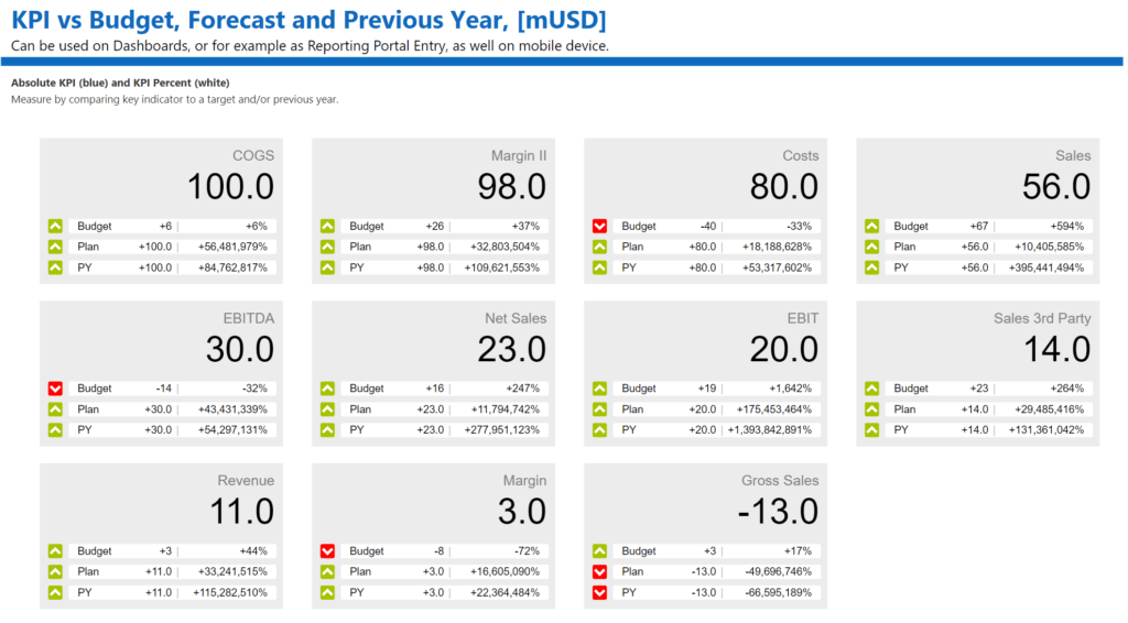
The examples below show the Ultimate KPI Card in Power BI reports, including classic KPI cards, arrow indicators, and small multiples.
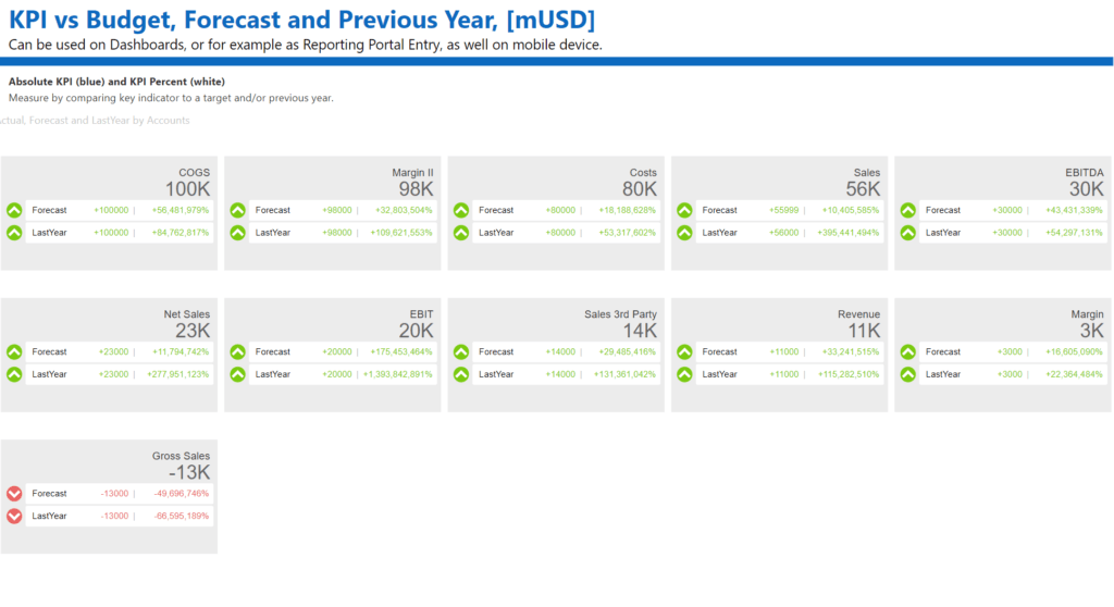
Small Multiples
Share your report with Export to PowerPoint or email subscriptions, and use the Ultimate KPI Card to filter other visuals.
Related: Ultimate KPI licenses and product options.
Formatting examples
Example 1: Sales vs Budget executive card
- Add Sales to Value.
- Add Budget to Reference 1.
- Set Chart Render > Render to Abs / %.
- Leave Arrow > Negative is Good off.
- Set Name > Title to
Sales vs Budget.
Example 2: Cost vs Budget card where lower is better
- Add Actual Cost to Value.
- Add Budget Cost to Reference 1.
- Turn on Arrow > Negative is Good.
- If you want variance as budget minus actual, turn on Chart Render > Invert Variance Calc. (Ref – Value).
- Use red/green arrow colors that match your report theme.
Example 3: Regional KPI grid
- Add Region to Small Multiple.
- Add your KPI measure to Value.
- Add target measures to Reference 1, Reference 2, or Reference 3.
- Keep Grid > Auto Columns on for responsive layout.
- Adjust Grid > Cell Padding and Gap between Cards for readability.
Example 4: KPI with monthly trend
- Add Month or Date to Trends.
- Add the current measure to Value.
- Add the target or budget measure to Reference 1.
- Turn on Trend Chart > Show.
- Choose Trend Chart > Configuration > Chart Type based on your story: Area for magnitude, Line for comparison, or Bar for variance.
Troubleshooting
| Issue | What to check |
|---|---|
| The visual shows a landing/empty state | Confirm that a numeric measure is placed in Value. |
| Reference rows do not appear | Add at least one measure to Reference 1, Reference 2, or Reference 3. |
| Trend chart does not appear | Add a field to Trends, add at least one reference measure, and keep Trend Chart > Show on. |
| Images do not appear | Confirm Small Multiple and Images are populated, Image > Show is on, and Value > Manual Status Shape is off. |
| Status shape does not match expected symbol | Check the Status measure. Use 1 for circle, 2 for triangle, and 3 for square, or choose a manual Shape Type. |
| Negative values display with a minus sign | Turn on Chart Render > Negative Values in () if you prefer parentheses. |
| Positive/negative colors feel reversed | Toggle Arrow > Negative is Good for metrics where lower values are better. |
| Numbers use the wrong decimal or thousands separator | Turn on Chart Render > Decimal & Separator Symbols and select the desired symbols. |
| Card content is clipped | Increase visual size, reduce font sizes, reduce reference padding, or enable scrolling on a taller visual container. |
| Too many or too few small-multiple columns | Use Grid > Auto Columns for responsive layout, or turn it off and set Grid > Columns manually. |
Best-practice recommendations
- Use clear measure names or set custom Name and Reference titles so users understand the comparison.
- Match arrow colors to your organization’s semantic color standards.
- Use Negative is Good consistently for cost, risk, defects, or time-to-complete KPIs.
- Limit each card to the metrics needed for the audience. Too many rendered components can reduce readability.
- Prefer Auto Columns for responsive dashboards and fixed Columns for pixel-perfect report layouts.
- Keep trend axes visible while designing, then hide them only if the chart remains understandable.
- Use manual decimal and separator symbols only when the report must override the user’s locale.