Showing all 5 resultsSorted by price: low to high
Power BI Ultimate UpSet Plot Custom Visual
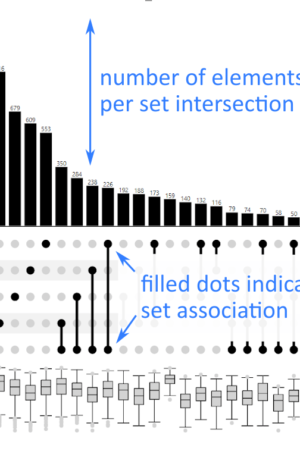
Ultimate UpSet Plot is a Power BI custom visual for exploring set overlaps when Venn diagrams become too complex. The product information explains that Venn diagrams work well for a small number of sets, but more than three sets quickly become messy. UpSet addresses that problem with a bar-chart-based technique for showing set intersections.
This visual is based on the UpSet approach described by Lex et al. and the UpSet.js ecosystem. It is useful for analysts who need to explain combinations across many groups without creating unreadable overlapping circles. In Power BI, that can mean customer behavior combinations, feature usage, multi-select survey answers, medical or research cohorts, product bundles, or any situation where entities belong to several sets at once.
What Ultimate UpSet Plot is useful for
- Set intersection analysis with more than three sets.
- Customer, product, or user segmentation where combinations matter.
- Survey and multiple-choice responses with many selected options.
- Research, operations, or quality analysis where overlapping cohorts need to be compared.
Key features
Ultimate UpSet Plot replaces confusing many-set Venn diagrams with a structured intersection view. It uses bars and set indicators to make combinations easier to compare, sort, and discuss. That makes it suitable for analytical Power BI pages where accuracy and readability matter more than decorative overlap shapes.
Licensing and product options
The products below list the available Ultimate UpSet Plot license or credit options for different deployment sizes.
Available product options
- 15 Credits Ultimate UpSet Plot
- 2 Credits Ultimate UpSet Plot
- 5 Credits Ultimate UpSet Plot
- 50 Credits Ultimate UpSet Plot
- Sales Offer Unlimited Credits Ultimate UpSet Plot