Showing all 5 resultsSorted by price: low to high
Power BI Ultimate Venn Diagram Custom Visual
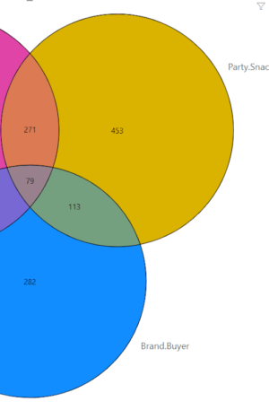
Ultimate Venn Diagram is a Power BI custom visual for exploring set intersections using Venn or Euler diagrams. The product pages explain that Venn diagrams are a common way to show overlaps between sets, while Euler diagrams can represent the amount of overlap through area. For up to three sets, this gives report users an intuitive view of how groups intersect.
This category is especially useful when a Power BI report needs to communicate membership, overlap, or shared attributes. Examples include customer segmentation, HR candidate evaluation, advertising channel attribution, survey answers, product usage groups, or any dataset where one entity can belong to multiple groups.
Best-fit reporting scenarios
- Customer segments where customers belong to more than one group.
- HR or recruiting analysis where candidates have overlapping skills.
- Marketing and advertising channel evaluation.
- Survey and multiple-choice analysis such as “How did you hear from us?”
Key features
Ultimate Venn Diagram gives report readers a fast visual explanation of overlaps that would otherwise require tables or multiple filters. The product pages also note the relationship to UpSet-style analysis for larger numbers of sets, making Venn a good choice for simpler and more immediately readable overlap stories.
Licensing and product options
The products below provide available Ultimate Venn Diagram license or credit options. Choose the level that matches the number of reports, authors, and readers in your Power BI setup.
Available product options
- 15 Credits Ultimate Venn Diagram
- 30 Credits Ultimate Venn Diagram
- 5 Credits Ultimate Venn Diagram
- 50 Credits Ultimate Venn Diagram
- Sales Offer Unlimited Credits Ultimate Venn Diagram